Circuit simulation and software workbooks like Matlab and Jupyter are great for being able to build things without a lot of overhead. But these all have some learning curve and often use clever tricks, abstractions, or library calls to obscure what’s really happening. Sometimes it is clearer to build math models in a spreadsheet.
You might think that spreadsheets aren’t built for doing frequency calculation and visualization but you’re wrong. That’s exactly what they’re made for — performing simple but repetative math and helping make sense of the results.
In this installment of the DSP Spreadsheet series, I’m going to talk about two simple yet fundamental things you’ll need to create mathematical models of signals: generating signals and mixing them. Since it is ubiquitous, I’ll use Google Sheets. Most of these examples will work on any spreadsheet, but at least everyone can share a Google Sheets document. Along the way, we’ll see a neat spreadsheet trick I should probably use more often.
Start at the Ending
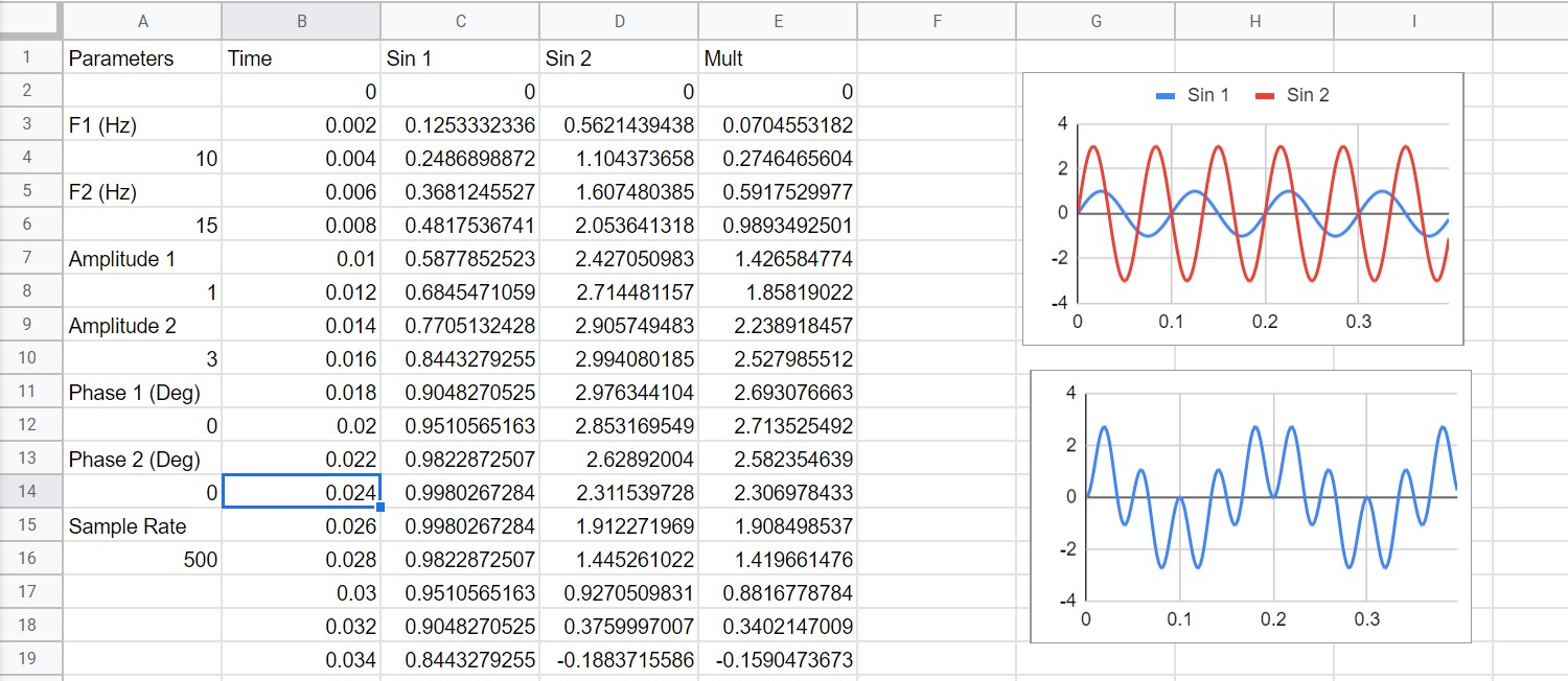
This is what the final spreadsheet looks like. There are two sine waves and we mix them together to get a sine wave that would decompose into the sum and their difference of the inputs. These are all real numbers — we’ll get to complex numbers in a later part of the series.
You’d think that mixing two signals would be adding them together. Turns out, adding in the frequency domain looks like multiplication in the time domain, so we actually want to multiply the two signals together. In general, a good math model for a sine wave is: y=A*sin(ωt+Φ) Let’s dissect what this equation to see what it’s all about.
The sine angle is in radians and ω is the frequency in radians. The Φ stands for a phase shift. So you can think of A as the amplitude — if A is, say, 5 then the output will go from -5 to 5. The frequency tells us how many “full circles” the signal will make in a second. Another way to say that is radians per second, which I’ll explain in depth in just a moment. The phase shift is how far the wave shifts (in radians) from a wave with zero degrees of phase shift. The t parameter, of course, is time in seconds.
What the Heck Are Radians?
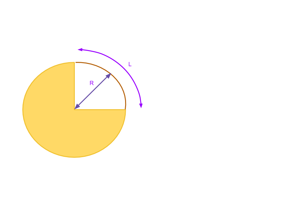 If your high school math is rusty, 360 degrees is
 2π radians. In math terms, a radian is related to an arc connecting the ends of an angle. To find radians, measure the length of the arc and divide by the radius of the circle. If the arc is the whole circle, you wind up with the arc’s length being the circumference of the circle — 2πr — and 2πr/r is just 2π. In practice, you convert degrees to radians by multiplying by π/180. For frequency, you multiply the cycles per second (Hertz) by 2π.
If you think about a sine wave, it is really showing a point on a moving and rotating circle. So each cycle is 2π radians. By multiplying the frequency in Hertz by 2π, we are converting to radians per second.
Look at the 90 degree angle in this diagram. The radius, R, is the same no matter where it touches the green arc. The arc, on the other hand, is 2πR/4 (since it is 90 degrees, or 1/4 of a full circle’s circumference). Then when you compute the radians the R cancels out leaving π/2 radians. Radians define how much of an arc the angle describes on any circle, no matter the actual size of that circle. If you work the math out, π/4 is 45 degrees, π is 180 degrees, and 2π is a full circle.
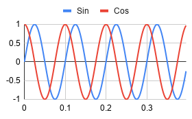 The phase is similar, too. A phase shift of 180 degrees (π radians) will cause the sine wave to be inverted relative to a sine wave with zero shift. A π/2 shift will line up the peak of the shifted sine wave with the zero crossing of the original sine wave. It is worth noting that a -90 degree phase shift of a sine wave is also called a cosine wave. As you can see below, the cosine wave starts at 1 and drops while the sine wave starts at 0 and increases.
Spreadsheet Tricks
All this math is pretty simple to set up in a spreadsheet. There are at least two ways to go. You can do lots of formulas, or you can use a trick to do one formula for each signal. Either way, you are going to need a timebase.
Here’s my signal generation spreadsheet. The timebase is in column B and uses the sample rate in A16. Cell B2 contains a zero. The next cell contains the formula B2+1/$A$16 which finds the time for the rate in A16 and adds it to B2. The dollar signs mean that when I copy and paste that to another cell, the spreadsheet won’t change the A16 reference. In fact, copy this to cell B3 and you get
You could also write a formula like (ROW()-1)*1/$A$16 That would do the same thing and there are many other ways to get the same effect. Either way, it is easy to copy the fromula from one cell then select from B3 to B1000 and paste. Your time base is done.
You can do the copy and paste with the signal columns and create a formula to paste. For example, cell C2 could be:
$A$8*sin(2*pi()*$A$4*$B2+radians($A$12)
Then you can copy it all the way down. However, using ArrayFormula is a much more clever way of doing this. The ArrayFormula function interprets ranges and uses them to form an array under the formula. That is easier to see in an example. Suppose you have the timebase in column B and for some reason, you want to multiply B1 by B2, B2 by B3, and so on. You could write: ArrayFormula(B1:B10*B2*B11). You can use scalars, too, like ArrayFormula($A$4*B1:B10).
This allows you to write (and more importantly, edit) one formula that fills in an entire array of data. Another nice feature, if you don’t like dealing with cell references, is the named range. If you go to Named Ranges on the Data menu you can do things like name A4 as Frequency1 and then use that instead of $A$4 in your other cells.
Graphs
The real fun begins with getting graphical outputs. Spreadsheets are typically good at doing this and you can see from the screenshots that plotting the two sine waves against each other works well. Mixing the two together in column E and graphing that is illustrative, too.
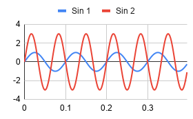
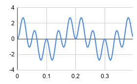
The key is to not try to graph all of the data at one time. The charts in my spreadsheet are doing 200 points (400 ms). Use the Line Chart type and then you can modify things like ranges and headings as you like. Looking at column E probably doesn’t tell you much, but the graph shows how the signals mix together quite nicely.
There are about 10 cycles of the high frequency and at 400mS full scale that works out to 25 Hz, the sum of the 10 and 15 Hz inputs. The larger slower component has two full cycles and that’s 5 Hz, the difference of the inputs which is just what you’d expect.
You can play with the various parameters to see the effects it has on both graphs. Armed with this kind of math model, you can start tackling other signal processing ideas: filters, IQ modulation and demodulation, and even more. But those are topics for another post.
No comments:
Post a Comment