-

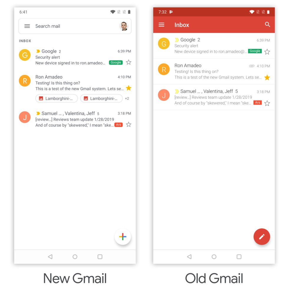
The new Gmail. It's very white. [credit: Ron Amadeo ]
Google is pushing a big redesign to the mobile Gmail app on Android and iOS. The update was announced yesterday, and after spending some time with the new app, we're going to comb through the finer details and see what has changed between New Gmail and Old Gmail.
For now the release is only out on Android, but like the old Gmail design, it should look identical on iOS. If you're on Android, you want Gmail version 9.x (the old design is Gmail 8). If the Play Store isn't serving you the update and you're into sideloading, APKMirror has a safe download. The iOS version is still wending its way through the App Store approval process, and should be out sometime this week.
The new design is a good match for the new desktop Gmail design that came out in April, along with all the other apps using the "Google Material Theme" design language. Everything is really white—an homage to the Google homepage—and everything uses rounded corners. The horizontal line dividers are gone, leaving nothing but white space to separate your messages. Control iconography is changed to Google's new outline style, and while message text remains in the Roboto font, everything else now uses Product Sans (the same typeface as the Google logo).
No comments:
Post a Comment