-
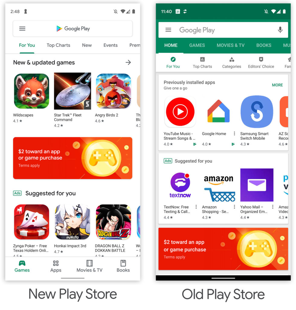
The new Play Store. It is very white. [credit: Ron Amadeo ]
Google seems to be rolling out a major new redesign of the Google Play Store. We've seen this design slowly take shape through limited testing over the past few months, but now it seems like the design is finally coming to a wide array of devices. Sometimes these designs are just out for testing and they get rolled backed, but with the launch of Android Q on the horizon, we get the feeling this version will stick.
The new design is in line with the revamped "Material Design" spec that Google launched with Android 9 Pie last year. This style uses the Google.com homepage as a design inspiration, and as a result it is very, very, very white. You can see a lot of this design today in Android P and Q and in the new Gmail design that launched earlier this year.
The Play Store sells Apps, Movies, Books, and Music, and the previous design used boldly-colored headers to differentiate between the sections. These colors still exist in minor highlights, but mostly the app is completely monochrome now. Only content thumbnails provide pops of color.
Read 7 remaining paragraphs | Comments


No comments:
Post a Comment