-

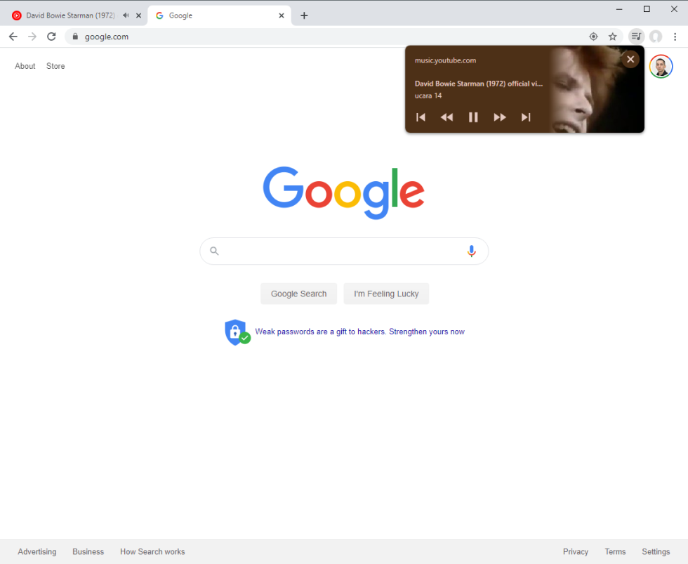
Check out that new button! It's for media controls. [credit: Ron Amadeo ]
Chrome is getting a new "Media Hub" feature that puts media controls for all your tabs right at your fingertips. The new feature takes the form of a button that lives next to your profile picture and menu button in the top right corner of Chrome. Click on it, and you'll see control cards for all of your tabs that are currently playing media. Google announced this feature on the Chromium blog recently, but the post has been taken down. We have a mirror here as a PDF.
The media controls previously launched on Chrome OS in August, but now they are coming to the Windows, Mac, and Linux versions of Chrome, too. In its most basic form, the media control will display the currently playing site's URL, title, and a single button for "pause." This form of the notification control works for everything I tested, and it's a great way to quickly find that noisy tab you just opened and silence it. Sites can implement more enhanced support for this feature, and then it works just like Android's media control notification. The control card can display previous, next, rewind, and fast forward buttons, plus album art. Just like on Android, the notification will color itself according to colors automatically chosen from the album art. So far, YouTube is the only site I've come across that supports the full feature set of these richer media controls.
Google's blog post said the new feature is rolling out to everyone now, although the blog post did get pulled so it's possible the timeframe may change. The good news is that you can enable the feature right away by digging into the flags settings to enable the "Global Media Controls" (just paste chrome://flags/#global-media-controls into the address bar). After a relaunch, you should see the new button.

No comments:
Post a Comment