-

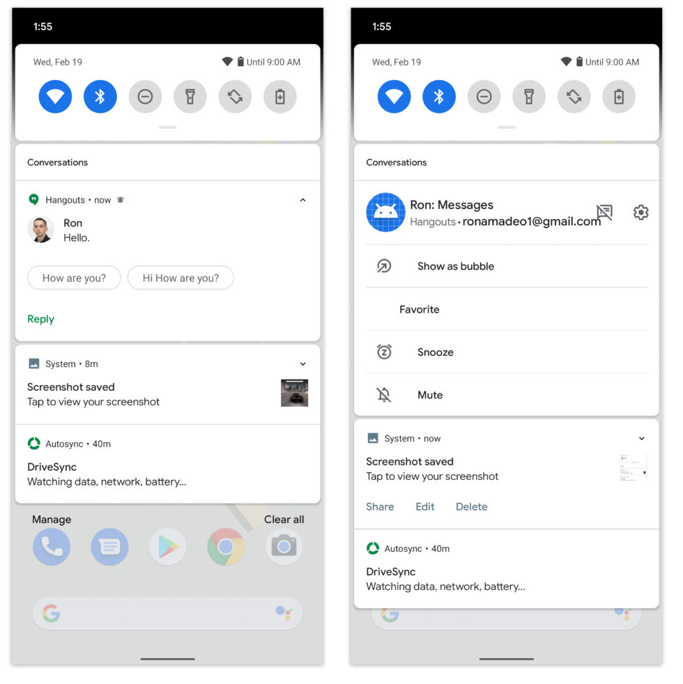
Left: The new "Conversations" notification section. Right: Long-pressing on the message notification and opening up a huge option panel. [credit: Ron Amadeo ]
The Android 11 Developer Preview is out, and I've tried it for a few hours. I'm back to report my findings.
To be honest, there are not a lot of user-facing changes in this first preview release. Like the earlier Android 11 post laid out, this is almost entirely API changes with little to see from a UI perspective. Right now, Android 11 looks just like Android 10. Hopefully, Google is just holding back, and we'll see more in future Developer Preview releases.
As for what's here, like we suspected, there is now a "conversations" section of the notification panel that incoming texts and messages end up in. The section is sorted at the very top of the notification panel, above regular notifications and silent notifications. If you long-press on a message notification, you'll get a whole host of options. You can banish a certain type of notification from the "messages" category, show a message as a bubble, "favorite" a person to sort them above every other person, snooze a notification, or mute a notification.
No comments:
Post a Comment