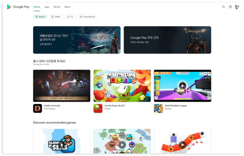
Enlarge / The new Play Store website design. It looks just like the Android app. (credit: Android Police)
The Google Play website is getting a long-overdue redesign. Android Police was the first to spot the dramatic new look. It's not exactly official yet but is rolling out to several people.
While the Play Store app on Android devices is continually updated, the website has mostly been forgotten. The current Google Play website design dates back to 2013. The site has had some small tweaks since then, but the bones of the site are still eight years old, and it presents content in a card motif that Google has moved on from. The new website looks just like the Android app. That means lots of whitespace and a layout focused on app icons and video thumbnails.
Back in 2013, Google envisioned the Play Store as a one-stop shop for all content from Google. At the peak of its powers, the Play Store sidebar had six sections: Apps (and Games), Movies & TV, Music (and podcasts), Books, Magazines (and News subscriptions), and even a physical "Devices" section for Nexus phones. Today, Google Play is a lot less powerful. Music has been taken from Google Play Music and is now a YouTube product. Podcasts now live at Google Podcasts and will probably also be taken over by YouTube in the future. YouTube and Google Play Movies & TV currently overlap, since they both sell premium Hollywood video content. On some platforms, like Smart TVs, Google is shutting down the Play section in favor of YouTube. Devices are now sold at the standalone Google Store website.
No comments:
Post a Comment