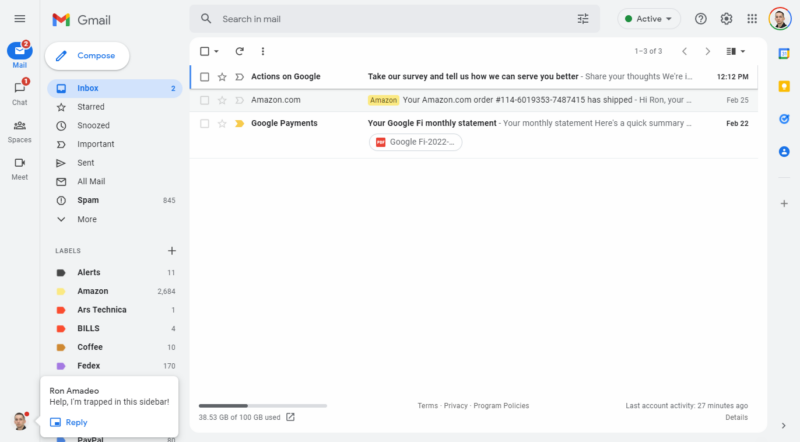
Enlarge / The new Gmail design. You can see a chat popup in the bottom left. (credit: Ron Amadeo)
Gmail's latest redesign seems to have finally started hitting a wide number of accounts over the weekend. The new desktop site changes up the 2018 design by turning the top and side portions of the web app gray, turning the red highlight to blue, and rounding over some of the corners. Oh yeah—it also adds a big, second sidebar to the left side of the screen. The normal Gmail sidebar showing all your mail sections is still there, but now there's a whole additional sidebar that is basically an app switcher for other Google apps. It's weird.
The new colors are fine, but Gmail is theme-able anyway, so the new default design doesn't really matter much. But the new "integrated view" and sidebar will probably cause controversy. You're on Gmail.com to check your email, and now on the side of the screen, there are four new buttons. There's "Mail," which is just Gmail. Then "Chat" and "Spaces," which are both for Google's latest messaging service, Google Chat. Then there's a button for Google Meet, Google's Zoom competitor.
That's pretty much it. A top-to-bottom vertical bar to display four measly buttons (five if you count the returning hamburger button) sits next to a desolate Siberian wilderness of whitespace. Oh, if you happen to get an incoming Google Chat, you'll see a profile picture pop-up in the abyss that is the bottom of the new sidebar. This is a huge waste of space for buttons that are irrelevant if you visit Gmail to—you know—use Gmail.
No comments:
Post a Comment